Assets Not Hours logo design

Resumen del concurso

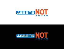
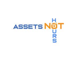
I need a logo for a web platform we are launching. The website is AssetsNotHours.com and will document & Share my personal journey from being a self-employed (owner-operator) of local service company (Residential Real Estate Appraisal) to actually owning a business that generates income, without me sacrificing 12 hours a day away from my family " working." The key piece for me was that I decided to go out on my own, specifically so that I could and would be able to focus on my family and actually have the time-freedom to enjoy them. I haven't made the transition yet. I will use the site to document my story and share what I learn along the way with other self-employed people experiencing the same struggles. As I identify and test viable strategies like affiliate marketing, real estate investing, etc. I will offer these and other solutions to my target market. I don't currently have a color scheme so I'm open on that aspect.

In the book Rich Dad Poor Dad, Robert Kiyosaki explained it this way: I currently own a JOB (self-employed), and this is the hardest and most unsatisfying position to be in because there is no finish line. If I don't work, there is no money. I want to transition myself into a Business Owner, that receives income whether I trade my time & energy or not. As a business owner, I own systems (assets) and they do the work. The logo should demonstrate this dichotomy.

Habilidades recomendadas

Comentarios del empleador

“I had no idea it would be this easy. Thank you!”

Imagen del perfil jrob41, United States.

Principales propuestas de este concurso

Ver más participaciones

Tablero de aclaración pública

  • jrob41
    Organizador del concurso
    • 4 años atrás

    This is too simple, and it doesn't display a transition of difference between the asset based lifestyle I'm working toward, and the hours base work life I currently have. I want to stop trading my hours for money, and build an asset (or assets) that will provide money. In Rich Dad Poor Dad terms, I want to transition from being an "S" self-employed person who owns a job, to a "B" business owner that owns a system (assets.) The logo should represent that transition.

    • 4 años atrás
    1. Abid1997
      Abid1997
      • 4 años atrás

      Sir,I understand your concept please check my entry.

      • 4 años atrás
    2. Abid1997
      Abid1997
      • 4 años atrás

      Sir,what about 122-121

      • 4 años atrás
  • pkdmvg
    pkdmvg
    • 4 años atrás

    #111 see this please

    • 4 años atrás
  • pkdmvg
    pkdmvg
    • 4 años atrás

    #110 see this please

    • 4 años atrás
  • jrob41
    Organizador del concurso
    • 4 años atrás

    #106 I see where you going, turning the A into a house. This is an Asset. I like that, but if possible it should be representative of several classes of assets. Also, I don't like the border.

    • 4 años atrás
  • jrob41
    Organizador del concurso
    • 4 años atrás

    #107 not sure of the symbolism with this one.

    • 4 años atrás
  • pkdmvg
    pkdmvg
    • 4 años atrás

    #107 see this please

    • 4 años atrás
  • jrob41
    Organizador del concurso
    • 4 años atrás

    #105 Not sure what the red spot is supposed to represent. can you give more clarification or choose another symbol

    • 4 años atrás
  • jrob41
    Organizador del concurso
    • 4 años atrás

    #59 & 69 let's see these in Title Case

    • 4 años atrás
  • jrob41
    Organizador del concurso
    • 4 años atrás

    #31 can you incorporate the graphic with the words?

    • 4 años atrás
  • jrob41
    Organizador del concurso
    • 4 años atrás

    #34 & #33 #64 #65 #66 #67 Let's see these with a smaller "Not"

    • 4 años atrás
  • jrob41
    Organizador del concurso
    • 4 años atrás

    #41 I do like the emphasis on Assets, and minimization of Hours.

    • 4 años atrás
  • jrob41
    Organizador del concurso
    • 4 años atrás

    #41 not sure why the 'Not' is designed this way. I like it BUT it doesn't have any significance to my knowledge

    • 4 años atrás
  • jrob41
    Organizador del concurso
    • 4 años atrás

    The "Not" should not be the same size as Assets. Also please make Title Case instead of all UPPERCASE

    • 4 años atrás
  • jrob41
    Organizador del concurso
    • 4 años atrás

    Please do not add multiple versions of the same logo

    • 4 años atrás
  • jrob41
    Organizador del concurso
    • 4 años atrás

    #95 Assets should be emphasized, not 'hours' or 'Not"

    • 4 años atrás
  • jrob41
    Organizador del concurso
    • 4 años atrás

    #40 Could be good. please make title case and distinguish the 'Not' a bit more. maybe use place a circle & bar across the entire word 'not'

    • 4 años atrás
  • jrob41
    Organizador del concurso
    • 4 años atrás

    When submitting a sample, please make sure it is spelled correctly... "Assets Not Hours"

    • 4 años atrás
  • jrob41
    Organizador del concurso
    • 4 años atrás

    General Note - I do not like ALL CAPS logos.

    • 4 años atrás
  • jrob41
    Organizador del concurso
    • 4 años atrás

    #94 This is not for an appraisal company

    • 4 años atrás
  • suyogapurwana
    suyogapurwana
    • 4 años atrás

    please check #92. Thank you

    • 4 años atrás
  • jrob41
    Organizador del concurso
    • 4 años atrás

    #5 simple clean design, but no references to either trading hours or building of assets

    • 4 años atrás
  • jrob41
    Organizador del concurso
    • 4 años atrás

    #3 incorporates the use of a clock to represent "hours". I like that, but the clock is too big, and there is no representation of the assets that I'm moving towards (or trading in for all together)

    • 4 años atrás
    1. jrob41
      Organizador del concurso
      • 4 años atrás

      These comments are meant for #11, not 3. also the 'hours' are too spread out

      • 4 años atrás
  • jrob41
    Organizador del concurso
    • 4 años atrás

    #13 I like the emphasis on the word Assets, and I like the pointer graphic, but it does there are no references to where we start from (i.e. trading Hours, instead of building Assets)

    • 4 años atrás
  • thedesignerwork1
    thedesignerwork1
    • 4 años atrás

    Feedback please.#11

    • 4 años atrás

Mostrar más comentarios

Cómo comenzar con los concursos

  • Publica tu concurso

    Publica tu concurso Fácil y rápido

  • Recibe montones de propuestas

    Consigue toneladas de propuestas De todo el mundo

  • Elige la mejor propuesta

    Elige la mejor propuesta ¡Descarga fácilmente los archivos!

Publica un concurso ahora o únete a nosotros hoy