Tablero de aclaración pública

  • owenbell7
    Organizador del concurso
    • 3 años atrás

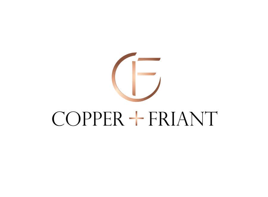
    Why don't you experiment. For example what would it look like if the starting point of the "C" didn't lean at the tip, but started horizontal? Then make a break under the left arm of the "F" to make a complete "C". And then start with the tapered part of the "O" to almost complete the circle?

    • 3 años atrás
  • owenbell7
    Organizador del concurso
    • 3 años atrás

    Color looks better. So does the round-ness. Something about the icon looks off. I need to think about it. 3.75 stars from 3 stars.

    • 3 años atrás
    1. amrkhaled32
      amrkhaled32
      • 3 años atrás

      do you think If I make the top of f nearer will be better

      • 3 años atrás