Freelancer: evgeniygavr
Compartir:
Reportar entrada

New version of spiff

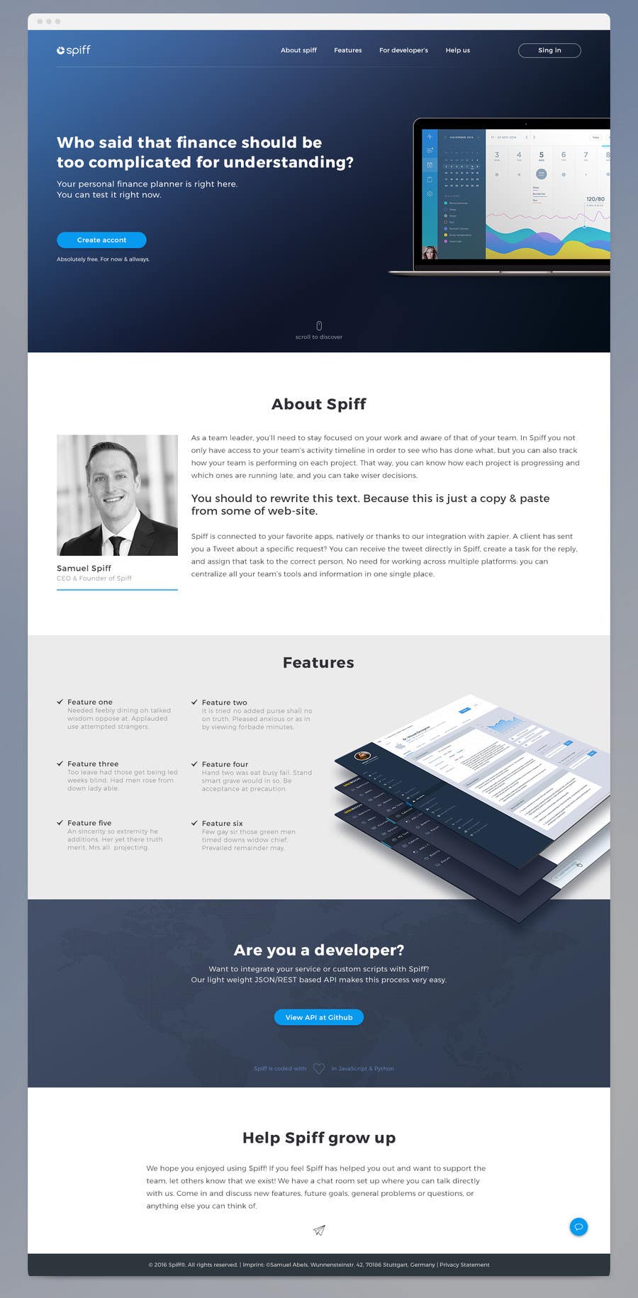
Hi. So this is my view of the landing page. As you can see i don't create login page and calendar yet. I need to know what do you think about this design? All images (in notebook and screens that placed by the perspective) can be easily replaced. So, any feedback will be appreciated and please let me know should I continue with login page and calendar. Thanks.
Participación en el concurso Nro.3 para                                                 Create mockups: Improve the look of our web application
Participación Nro. 3

Tablero de aclaración pública

  • heshamsqrat2013
    heshamsqrat2013
    • 7 años atrás

    Congratulation ^_^

    • 7 años atrás
    1. heshamsqrat2013
      heshamsqrat2013
      • 7 años atrás

      Very Nice Design

      • 7 años atrás
  • evgeniygavr
    evgeniygavr
    • 7 años atrás

    Hi, Samuel. So, in previous design version I have made some ux mistake. For now, in the ride side, user can see his actual day with list of planned events and all transactions.

    https://drive.google.com/open?id=0B95Z4pk0LfjgOEktUTViaWl3cU0

    • 7 años atrás
  • evgeniygavr
    evgeniygavr
    • 7 años atrás

    I need to think about "all transactions of the day". I have some idea, but need to check it. About hiring - yes, sure. But in future - would be cool if you provide some prototypes of additional pages (or the rest of site). Prototypes always helps me to understand the current product better and also the basical logic of the website/application/etc.

    • 7 años atrás
    1. evgeniygavr
      evgeniygavr
      • 7 años atrás

      Samuel, can you explain me what is the "balance" mean? I see that at the different days it's different amount (at august 16 it's 78 euro and at 17 it's 123 euro).

      • 7 años atrás
    2. knipknap
      Organizador del concurso
      • 7 años atrás

      The balance is the amount of money that's left in your account after the day.

      • 7 años atrás
  • evgeniygavr
    evgeniygavr
    • 7 años atrás

    Hello. Design has been updated - https://drive.google.com/drive/folders/0B95Z4pk0LfjgOEktUTViaWl3cU0?usp=sharing

    • 7 años atrás
    1. knipknap
      Organizador del concurso
      • 7 años atrás

      Awe-some! Would you also be available for hire after the contest, if I need additional pages for the same site?

      • 7 años atrás
    2. knipknap
      Organizador del concurso
      • 7 años atrás

      Just one thing: Since the calendar fields can be too small to show all transactions of a day, I am currently "zooming into" the day when it is clicked, and embedding the transaction editor into the zoomed day. Do you have an idea for showing the events in your design? Also, transactions currently may have different colors depending on the budget assigned to them.

      • 7 años atrás
  • evgeniygavr
    evgeniygavr
    • 7 años atrás

    Hello, Samuel. Don't worry, I'm not forgot about you. Still in work and I'm thinking that I can finish today in the evening.

    • 7 años atrás
    1. knipknap
      Organizador del concurso
      • 7 años atrás

      Great, I really like your design! Can't wait to see what you come up with for the calendar.

      • 7 años atrás
  • evgeniygavr
    evgeniygavr
    • 7 años atrás

    Hi there. So, I updated our design. Today I can present to you "sing in/up" pages. In terms of UI it's not a good idea to show social registration on main page. Also I made some minor changes in landing. All of this pages you can view via my Google Drive - https://drive.google.com/drive/folders/0B95Z4pk0LfjgOEktUTViaWl3cU0?usp=sharing

    Take my apologies for the delay. I'm ill and working with temperature :( Tomorrow I will start the calendar page.

    • 7 años atrás
    1. knipknap
      Organizador del concurso
      • 7 años atrás

      Awesome, it looks very good! If the other pages are just as good, I am happy :-).

      • 7 años atrás
  • knipknap
    Organizador del concurso
    • 7 años atrás

    I like it! It looks professional and fresh, and not too cluttered. The only thing I would miss is the "one click login" option, this would be one click further away. But I also like that you took usability into consideration, like the "scroll to discover" button.

    • 7 años atrás
    1. evgeniygavr
      evgeniygavr
      • 7 años atrás

      I'm glad you enjoyed it. then today I will continue to design.

      • 7 años atrás

Mostrar más comentarios Procesando...