boushib
Morocco

Hi.
I need someone to create a clean and puristic look & feel for my desktop only (no responsive) website.
That website is a management system / control panel for our internal webserver management, so I do NOT want to have a site with all the bells and whistles which are possible in HTML...
I want a more simple design with clear lines and I want to recognize a clickable button by looking at it and not by guessing!
I am talking about a design like these:
https://www.ispconfig.org/ispconfig/online-demo/
-> http://demo3.ispconfig.org/
Login with client / demo
Click at 'Sites'
Click at 'server1.example.com'
https://adminlte.io/themes/AdminLTE/pages/forms/general.html
https://getbootstrap.com/docs/4.0/examples/checkout/
http://webapplayers.com/inspinia_admin-v2.8/form_file_upload.html
At the sites mentioned above I like their 'minimalistic' design where contents which are belonging together are "grouped"/silhouetted against the rest.
I also need to have a header and a footer!
About the technology:
As I said:
"Responsive" (e.g. for supporting Smartphones) is not needed. (The support for collapsing a giant table (where need) might be OK.)
(Although the above example are using bootstrap that is not a requirement! Hand made or W3.CSS or whatever is also OK!)
We only need support for newer browsers:
Firefox 60.3.0esr+
IE 11+
Microsoft_Edge 40+
Safari 11+
Google Chrome 70+
Avoid px/em where it is not needed! Use percent!
We use the font Frutiger!
I have setup a few pages just for testing to show you the idea. (So do not laugh about the design.)
The logo in the upper left corner is not our real logo, but it is very similar!
Some remarks for the images/pages:
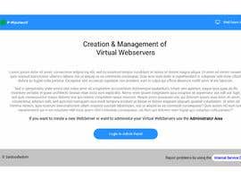
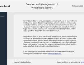
0-welcome.png:
Our welcome page (in font Frutiger).
I tried to create a header and a footer. (The footer isn't attached to the bottom. It's an error.)
I thought I like the background, but I am not sure... On the next page I tried something different...
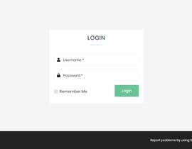
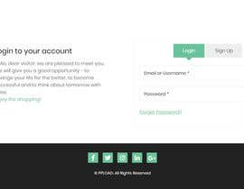
1-login.png:
2-login-error.png:
If you are not logged in you have to login.....
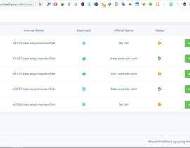
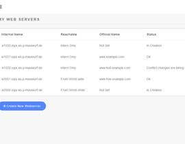
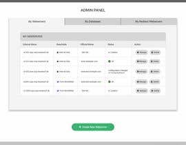
3-admin1.png:
My first idea was to have this with three tabs:
Here the user sees a table of his webservers (in the default tab "My Webservers").
A click at 'My Databases' at the left popups a similar table with his databases.
A click at 'My Redirect Webservers' at the left popups a similar table with his 'Redirect Webservers' (whatever this means).
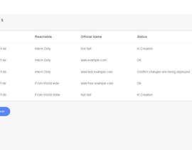
But if I do it with tabs I have a problem after clicking 'Create New Webserver' (see 4-create.png):
A 'Create New Webserver' creates a new page (URL changes) and I still see the tabs on the left which do not make any sense here...
So I changed it into real links. (A click at 'My Databases' will lead to a different URL.)
But a tab/links at the left steals to much place for the table...
Maybe you have a better idea?
The table needs a face lift!
Maybe you have a better idea for the two possible values of 'Reachable'?
The values of 'Status'?
And the entries unter 'Action' must be done better! (Maybe an icon?)
3-admin2.png
Show the logged in user as hover.
3-admin3.png
Show the options for the logged in user.
4-create.png:
You see a 'Terms and Conditions' page.
A few checkboxes are required
5-create-ok.png
Shows a successfull creation of a new webserver.
6-create-error.png
Shows an error while creating a new webserver.
7-manage-tab-left.png
8-manage-tab-middle.png
9-manage-tab-right.png
The management of the web area is divided into the parts/tabs.
Obviously this must be done more attractive!
In the future there might come more configuration items into each tab, but we ignore this at the moment.
(e.g cPanel which has a LOT more items to configure uses icons for each item to configure. So a new page pops up for each configuration item. We ignore this at the moment.)
Please feel free to ask any relevant questions.
“Great designer. Understands what I need, tried out different ways to make me happy and was almost everytime online!”
![]() weinschorle, Germany.
weinschorle, Germany.


Publica tu concurso Fácil y rápido

Consigue toneladas de propuestas De todo el mundo

Elige la mejor propuesta ¡Descarga fácilmente los archivos!